Introduction to the
NORMAL DISTRIBUTION
Module learning objectives
ggplot and modify its appearanceTwo weeks after starting grad school, you’re assigned to go to a small island east of Madagascar to study a mysterious mammalian species that has caught your advisor’s interest. After a long trip on various ships and smaller boats, you arrive on the island, excited to collect data on this new species.
The only information your advisor has given you is that they are small giraffe-like creatures. He called them teacup giraffes. You waste no time to suit up in your field gear, and your guide leads you deep into the dense island brush. Filled with anticipation, you start searching for your first subject.
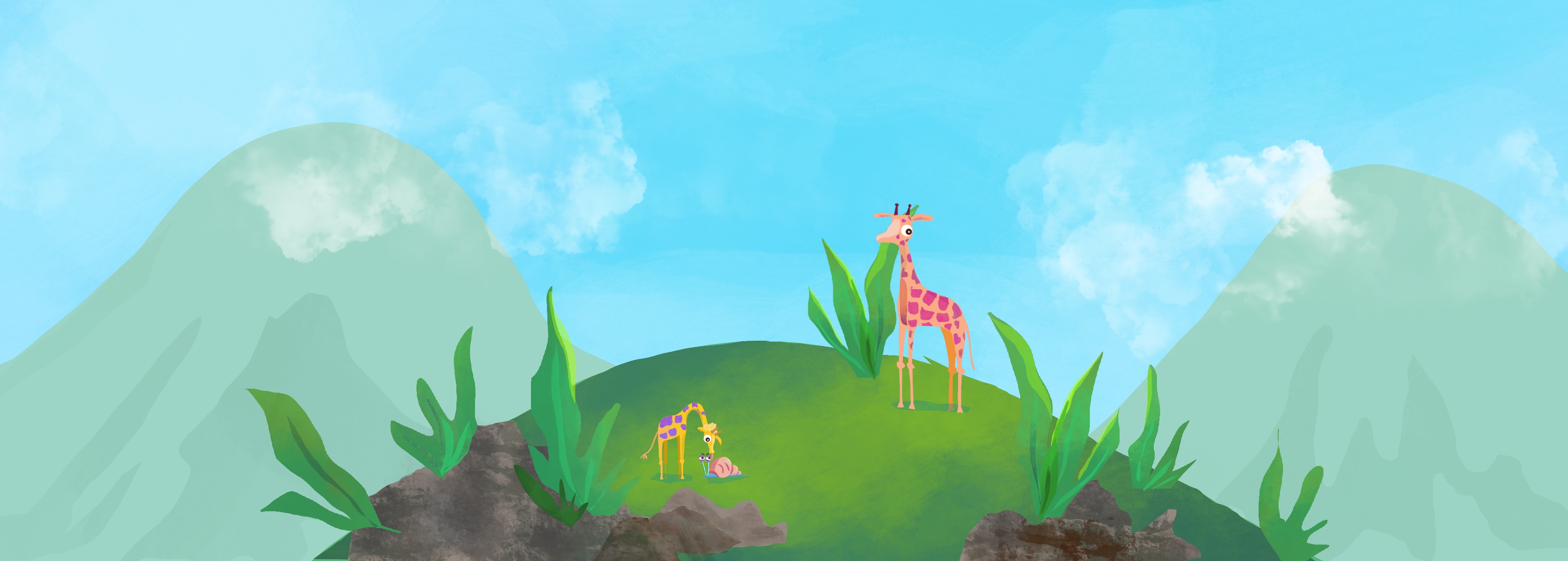
After a one hour hike, you reach a clearing where tall cypress trees encircle low growth vegetation. Suddenly, you experience your first encounter with a little giraffe, whose cool drink from a puddle you seem to have interrupted. Smaller than you had imagined–its slender body does not even clear the height of a dandelion. You toss a celery stick in its direction, and you’re pleasantly surprised that it immediately trots over to you and starts vigorously munching, creating a celery confetti cloud. After observing this behavior for a while and taking some notes on how quickly it devours your celery supply, you bring out your measuring tape and record the giraffe’s height.
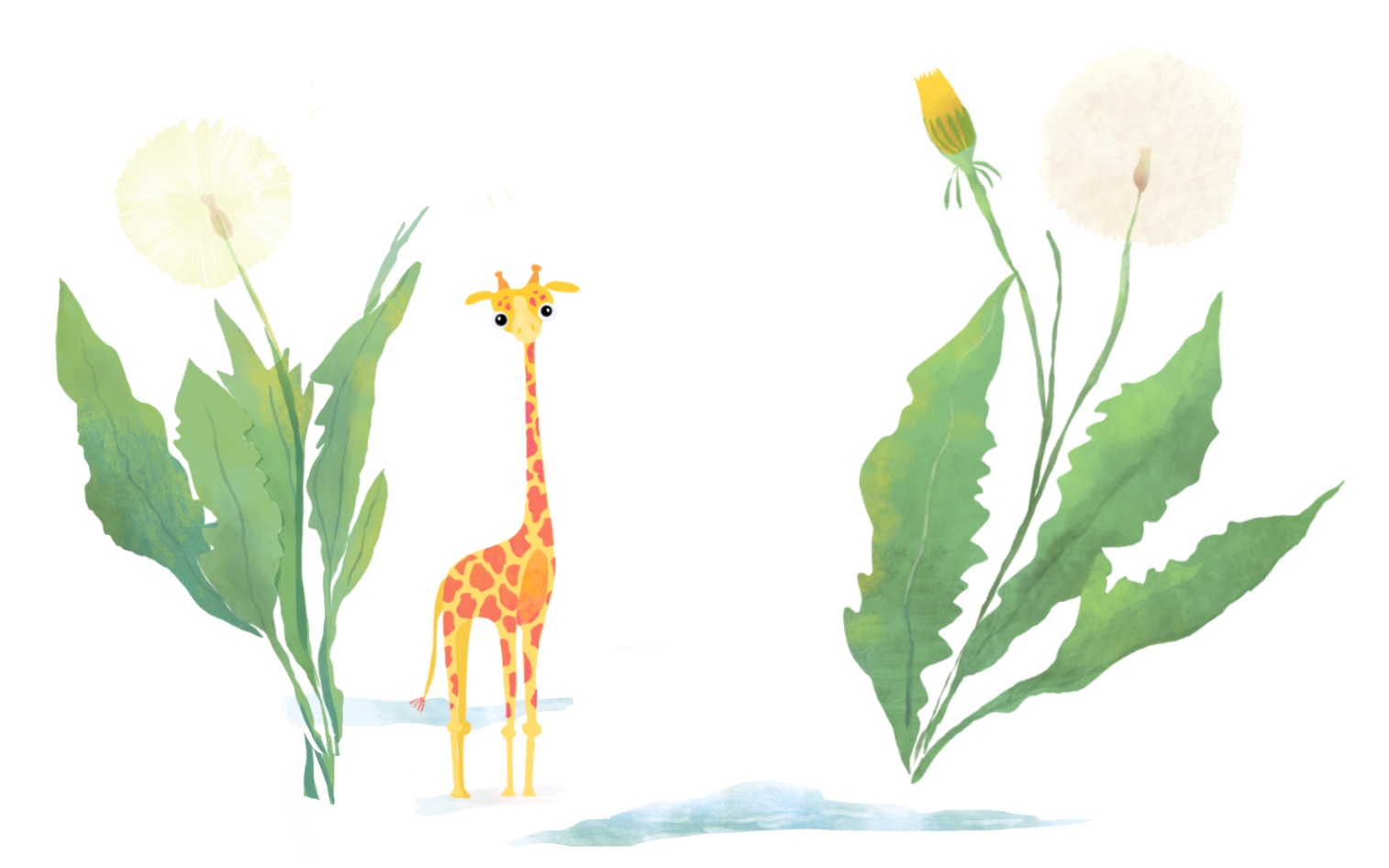
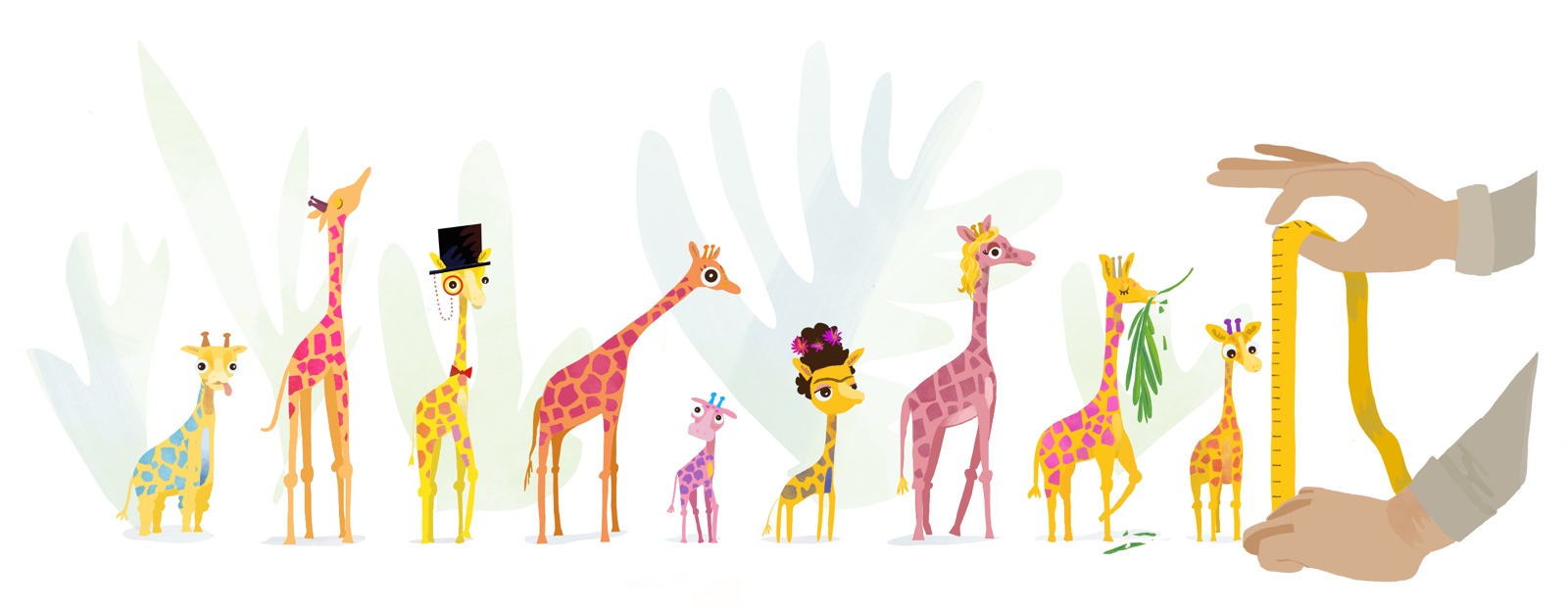
A few minuters later, you leave the clearing and forge a path through thick ferns and palm leaves. You pause for a drink from your water bottle long enough to pinpoint a fast-paced crunching noise. In the shade of a fallen tree, there’s another teacup giraffe annihilating a small patch of wild celery for its afternoon snack. You’re surprised how much smaller this one is–about as tall as your Swiss army knife. Throughout the day you encounter several teacup giraffes, and you realize that although all petite, they are remarkably variable in stature.
The next week is spent trekking and measuring every giraffe you can manage to get near enough. You take advantage of the fact that they come running everytime you pull out a celery stalk from your lunch bag, and you’re relieved that it takes them long enough to finish snacking for you to measure their height. With the help of your guide, you manage to measure 50 giraffes in the first week.
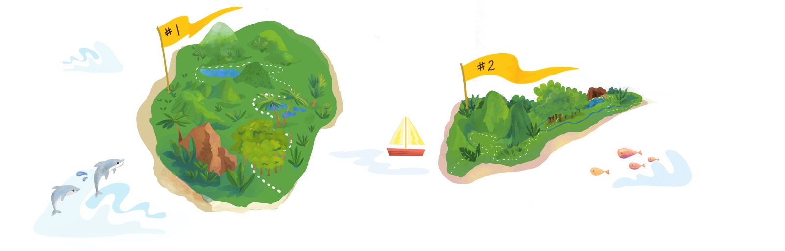
There is a second island not too far away, where your guide has indicated there may be more giraffes. You wonder how the population of giraffes on the second island may be different, and so you make arrangements to go to Island #2 the following week. It is not too long until you have added another 50 measurements of these tiny giraffes from this second excursion.
After collecting 100 measurements, you decide to take a first look at the data. What’s the best way to look at data when you know nothing about it…? You take a long walk on the beach to ponder this.
You can start by scanning the values for the shortest and tallest heights. You see the range is between 6 and 20cm. So you draw a ruler in the sand with the extreme heights on either end. You’d like to see how many times each height occurs in your data set, and so you grab a small colorful stone from the shore to represent each individual giraffe’s height and place it just above your ruler mark. You put out a new stone for each height and continue doing this for each individual to see which heights “stack up” along your ruler. To keep track of which heights came from different islands, you pick differently colored stones for each group. Look below for a sped-up version of this process! The y-axis is frequency. The x-axis is the height.
As you put the last stone in place, your local guide saunters by and glances at your markings, “What a nice histogram!”
The histogram above shows the distribution, or shape, of your data. The distribution of a variable in a data set gives you information about:
Checking the distribution of the data is always one of the first steps of data anlaysis. By knowing the shape of the data, you gain insights into some of the data’s statistical properties (which become useful down the line, for example, when you need to decide whether a particular statistical test would be appropriate).
Although the data can be distributed in many shapes, there are some general shapes that occur so frequently in nature that these distributions are given their own names. The most well-known distribution has a shape similar to a bell and is called the normal distribution (or sometimes “the bell curve” or just “normal curve”).
There are a few characteristics of the normal distribution:
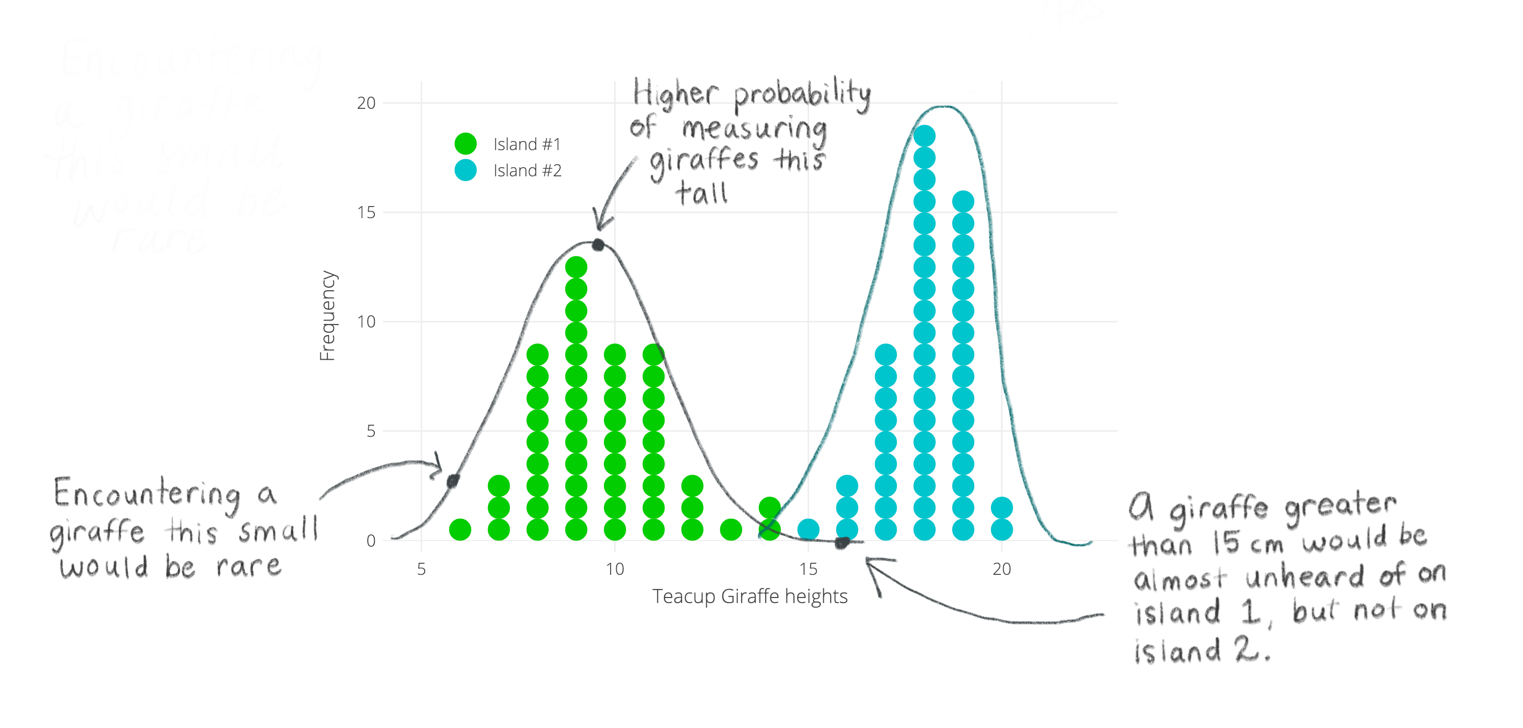
Taking a look at the stones in the sand, you see two bell-shaped distributions. One for each island. It looks like giraffe heights on each island follow a normal distribution— and that’s a good thing because you remember your stats textbook always talking about how normally distributed data behaves well! Phew!
Happy with your progress thus far, you are excited to send your histogram results to your PhD mentor back in the homeland. Instead of taking a picture of your stone histogram, you turn to R to create the perfect figure.Time to apply your Intro to R knowledge. The heights from your logbook have been stored in a data frame called d. Below we show the last few observations from this vector, using the tail() function, which all happen to be from Island #2.
tail(d)## Height Location
## 95 19.24044 Island #2
## 96 17.58925 Island #2
## 97 18.54274 Island #2
## 98 17.16631 Island #2
## 99 17.71318 Island #2
## 100 16.79124 Island #2ggplot2We will use the ggplot2 package for all our graphing. Check out this page as a reference.
We need some basic components as a bare minimum to get started. We can customize components later to make the graph more to our liking. The steps we will go through are:
First we need to tell R that we want to create a ggplot. This is done by using the ggplot( ) function. Within the parentheses, we can specify the data frame that contains what we want to plot, using the option data = d. We also have to tell ggplot what columns of the data frame to actually plot– we do this with the argument that stands for aesthetics: aes( ). In our case, only the x-axis variable Height needs to be specified.
Next, add a geom layer, which will determine the type of visual representation that will be used for the data. Different ggplot layers and options are added using a plus sign +. In our case, we will write + and then geom_histogram( ). To make your plot look similar to your sand drawing, you want to add an optional argument within the parentheses of geom_histogram, which will set the bin width to 1cm: geom_histogram( binwidth = 1 ).
Here we are using geom_histogram, but there are many other geom_ layers that you could use instead for different plot types. Check some of them out here.
A note about the +: You can keep adding new specifications on one long continuous line of code, separating each one with a +. However, if you’d like to make the code easier to read by adding each specification to a new line, make sure the + is added to the end of the first line and not the new one.
It’s a good idea to save any ggplot you make as an object. It’s a helpful practice for when you’ll do more complicated graphing later (e.g. combining plots).
Run the code below to see what this basic histogram in ggplot looks like:
Let’s go over some quick ways we can customize any ggplot. First, we can tell ggplot that we want the data from the two islands to be different colors. And second, we can to specify the colors we want to use.
Different color for each group: Within aes( ), we add a fill = argument. Here is where you put the name of the variable that contains the categories that you want to distinguish with different colors.
You might be wondering why we don’t use the color= here instead (which is a valid argument for aes( )), and this is because we want to change the color of the fill of the bars, while color = would change only the bar outline color (see below).
To choose colors ggplot should use, we need to add a new option + scale_fill_manual( ) and then specify the colors with the argument values =. To read more about how to create your own color scale, see this page. If you have more than one color you need to specify, make sure you combine them within the c( ) function.
Colors in R can be specified in different ways. For example, you can use a string of the color name (see possible colors here) or with hex color codes.
Outline Color: To change the color of the outline, specify color = within the parentheses of the geom_ (i.e. geom_histogram).
In the window below, we have added some options that you can play around with. Use the descriptions above to:
fill should be set to, as well as the colors for the fill and outline.

Playing around with “complete themes”: ggplot has a nice way of changing many non-data display parameters at once though what is referred to as “complete themes”. Check this page for the available options.
+ sign.
After trying different themes, you pick theme_light() and feel pretty good about your ggplot accomplishment. You send your plot to your PhD advisor, and within what feels like only minutes, you have a new attachment in your email inbox:
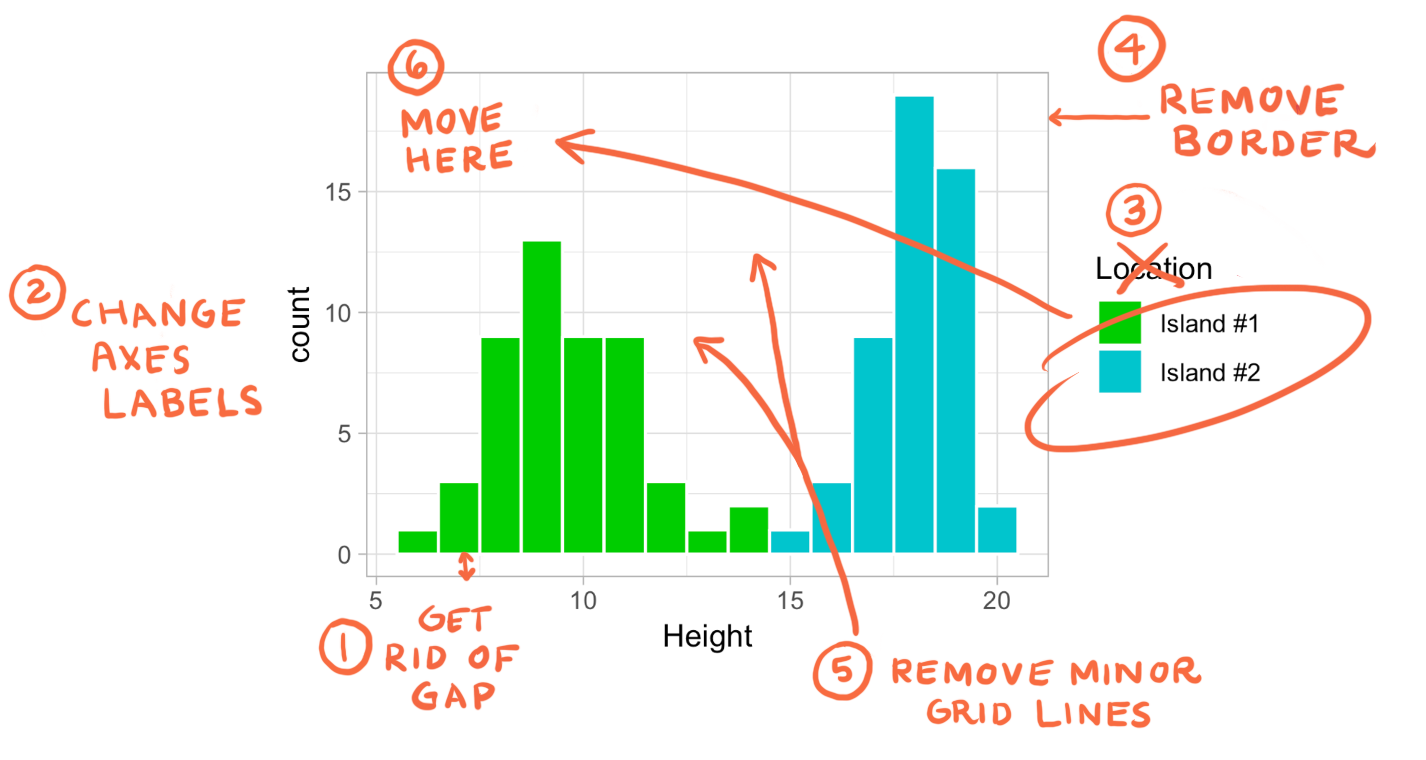
You’ve got some more changes to make to your plot. Let’s start with something easy:
scale_y_continuous() argument, and inside the parentheses specify expand = followed by two numbers within the c( ) command. These two numbers represent how much above or below the data’s range you would like to extend the y-axis by.The function scale_y_continuous can be used for other purposes. See some examples and more documentation can be found here.
Change axes labels: Add labs( ) to the existing ggplot layers and specify each axis you’d like to label as arguments, e.g. x =, followed by the string for your label. If you’d like to learn more about manipulations you can do with labs( ), see this reference.
In addition, labs( ) can be used to remove labels. In this case, we can also include fill = NULL to remove the legend label (recall that the categories for our legend were determined by the fill argument in aes() previously).
Use the window below to:
theme( ) argument. Nested within theme( ) we can use additional arguments, such as panel.border= and panel.grid.minor=. Many theme( ) arguments can be set to element_blank( ) to remove the element in question. To read more about what can be modifed with theme( ), check out this resource.
theme( ) to move the legend and make its background transparent. To change its position, use legend.position = followed by the c( ) command, in which you will specify the x- and y- positions. These values must be between 0 and 1. Specifying c(0,0), for example, would place the legend at the bottom left of the plot, while c(1,1) would place it at the top right.To change the legend background to be transparent, we essentially remove it. Add the argument legend.background =. Take a look at previous steps to determine how you remove an element.
Hopefully your PhD advisor in the homeland will be satisfied with your new ggplot!
Since we could not take the height of every giraffe on each of the two islands, and it is unclear how many giraffes live on the islands, we had to rely on taking the heights of randomly selected groups of giraffes.
A sample, in our case the 50 giraffes from each island, is a subset of a population. The population is defined as all available observations in a defined geographic area at a given point in time – in this case, all existing giraffes on one of the islands while you are there.
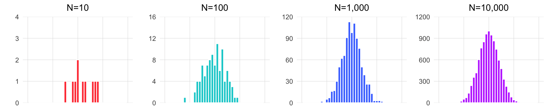
If we pick our sample in a random way, then our hope is that our sample data will be representative of the population. The larger our sample is, the more of the population it will include, and thus, the more closely the sample will resemble the population in its statistical attributes (e.g the distribution). We then must acknowledge that the smaller our sample is, the less likely it is that it will be representative of the population.
The animation below illustrates how small samples can depart from the characteristics of the population.
Take heed that with inadequate sample sizes, your sample data may barely resemble the population you’re interested in!
You decided that you had the resources to collect data on 50 giraffes on each of the islands. Will a sample of 50 be good enough to get a sense for the true values of the giraffe populations?
This project was created entirely in RStudio using R Markdown and published on GitHub pages.